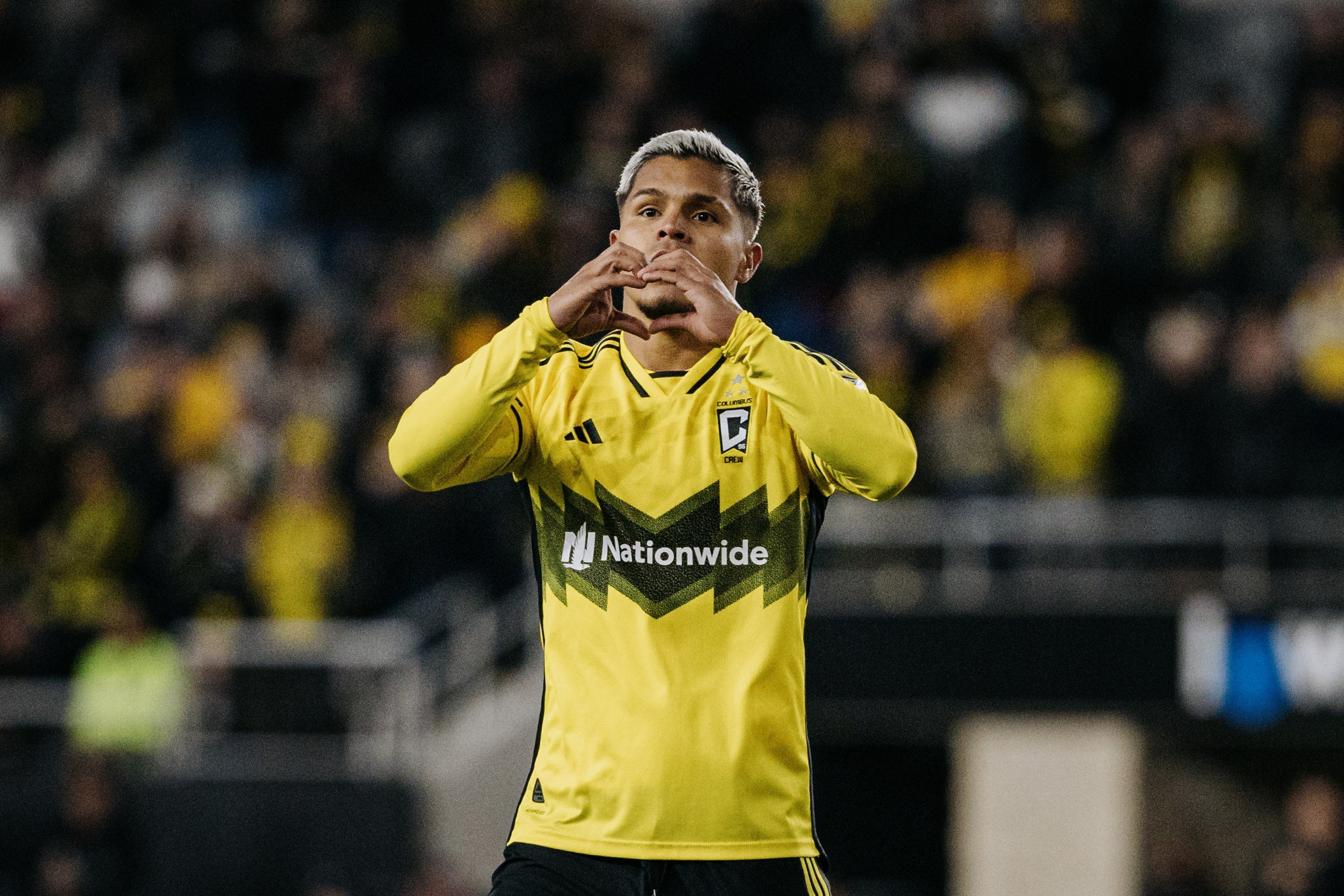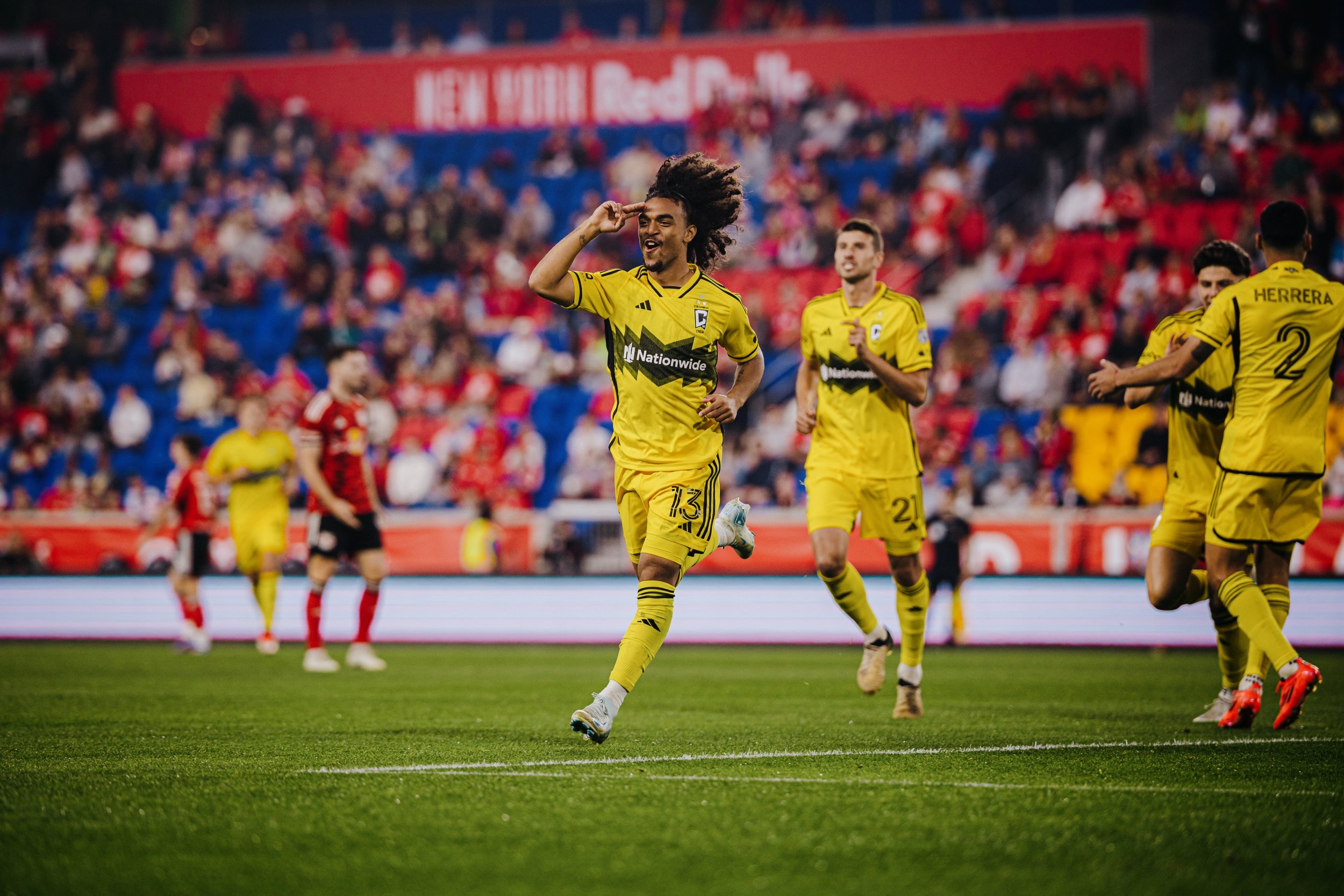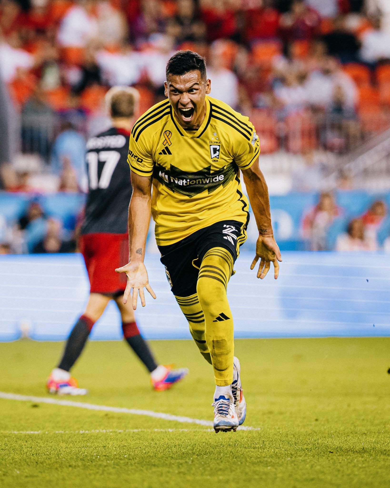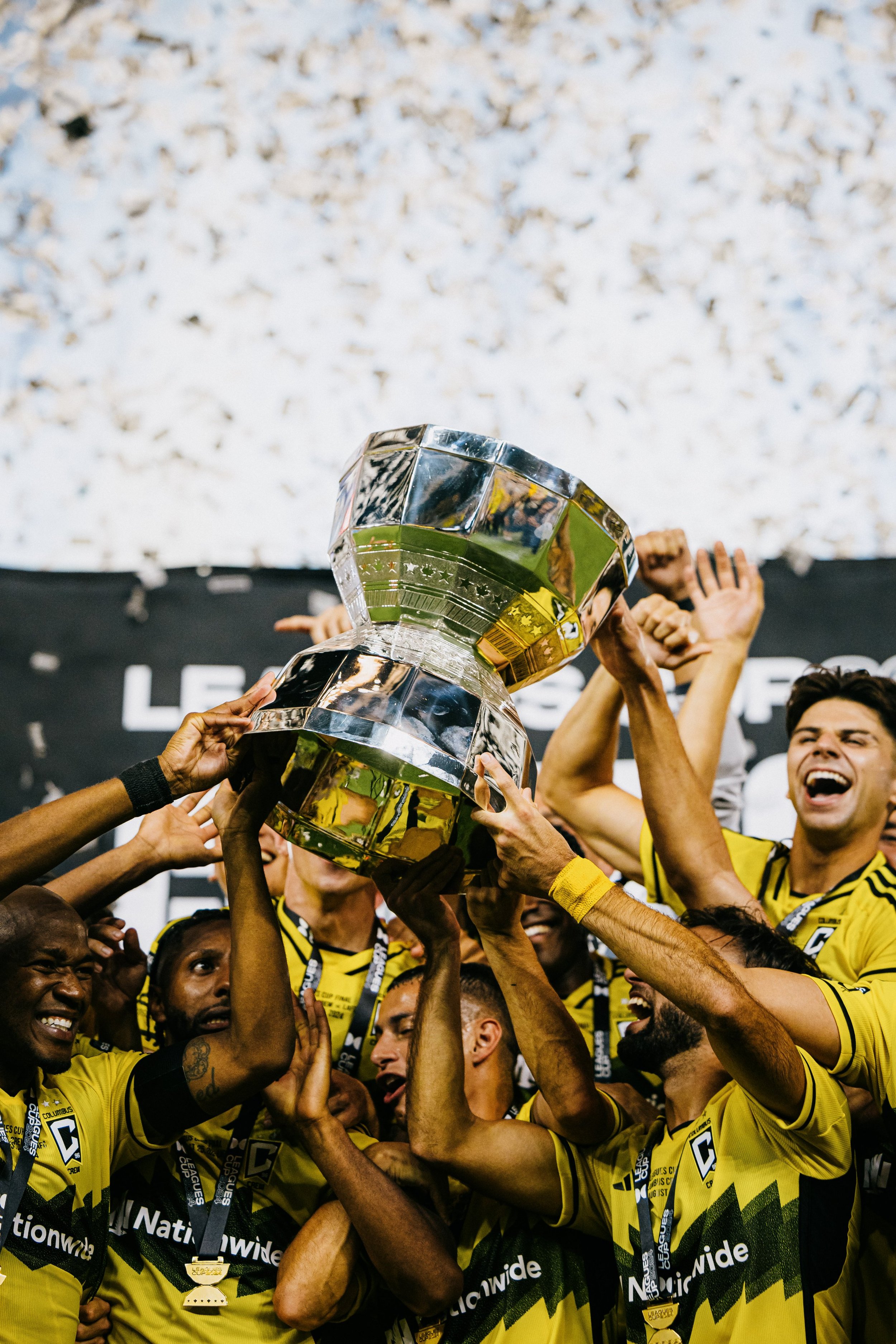
COLUMBUS CREW 2024 HOME
Service | Consultancy
Overall Concept - Home
In Major League Soccer (MLS), the terms primary and secondary kit are widely used instead of the traditional home and away kit naming. This distinction presented a unique opportunity to define what "home" truly means for a club; not just a location, but a feeling, an identity, and a connection to its fans and the community.
The approach began with the fundamental question: What is “Home”?
The Physical Place - Lower.com Field, Astor Park, the City of Columbus, The Ohio Health Performance Center.
The Emotional Experience - The sense of belonging, support, and shared history among players and fans.
Both aspects were used to create, and launch, a kit that visualises the meaning of The Crew’s home and displays the club’s deep rooted connection to the culture of soccer in the United States.
Storytelling and Launch: The Emotional Connection of "Home"
The design and it’s launch needed to reflect more than just a team, it had to evoke a feeling. Home is where players and fans come together, where legacies are built, and where lifelong connections are made.
Key storytelling elements:
A Sense of Belonging - Making players and supporters feel connected to something bigger than themselves.
Todos Son Invitados – Presenting the club as a unifying force where everyone is welcome, bringing people together under one badge.
A Place for Friends & Family - A nod to the relationships formed when following a team.
The Heart of American Soccer – A showcase of the role that Columbus has in shaping the game in the United States, both at a club level, and internationally.
Kit Design: Physical Representation of "Home"
To bring the concept to life, we requested to Adidas that the club’s physical home became a central design inspiration. The newly built first section of Astor Park and its distinctive zig-zag façades became the centre piece for a crossbar, in black, across the lower chest incorporating Adidas’ season graphic direction.
The final design achieved an overall balance between black and gold that separated it from the kit it was replacing with details on the cuffs and collar in black rather than the full cuff in the contrast colour. It was also important that the balance and consistency remained when using both black and gold short options so the same details that were present on the cuffs and collar are also present on the shorts.
This kit and launch was the kickoff of a season long story, one that merges emotion, history, and identity into a single visual representation.
Photo & Video Credits: Columbus Crew
Action Shots:


