AL-ITTIHAD 24/25 AWAY
Service | Apparel Design
Seasonal Creative Direction: Club Focus
For the 25/26 season, it was important to create an overarching connection between the three Al-Ittihad kits. The graphical style and storytelling that united the club’s kits was Club Focus; a concept that not only linked the designs aesthetically but also embodied the club’s ambitions and identity. Club Focus served as both the visual graphic direction and overall storytelling, which aligned with Al-Ittihad’s core values and goals.
This approach ensured that each kit reflected a balance between tradition, progression, and the future. The home kit honoured the club’s heritage whilst staying true to its iconic identity. The away kit represented being progressive, embracing modernity and evolution in its design. Meanwhile, the third kit pushed boundaries, symbolising a forward-thinking vision that embraces innovation and the future of the club.
By experimenting with various graphical styles, each kit played with visual perception and depth, creating a distinct yet connected aesthetic across the entire range. The result was a dynamic, meaningful collection that not only united the club’s kits but also reinforced Al-Ittihad’s commitment to honouring its past, evolving in the present, and shaping the future.
Graphic exploration included:
Blur - Soft transitions and dynamic movement effects.
Sharp - Crisp, defined details.
Classic - Traditional elements refined through modern techniques.
Gradient – Smooth colour shifts creating depth and energy.
Depth - Layered visuals emphasizing three-dimensionality.
Offset - Slight shifts and separations to create visual dynamism and interest.
Movement - Directional graphics suggesting speed and agility.
Glitch - Digital distortion for a contemporary look.
Grain - Textural elements adding richness and tactility.
Halftone - A technique to add shades of colour/blur through a 2 colour process.

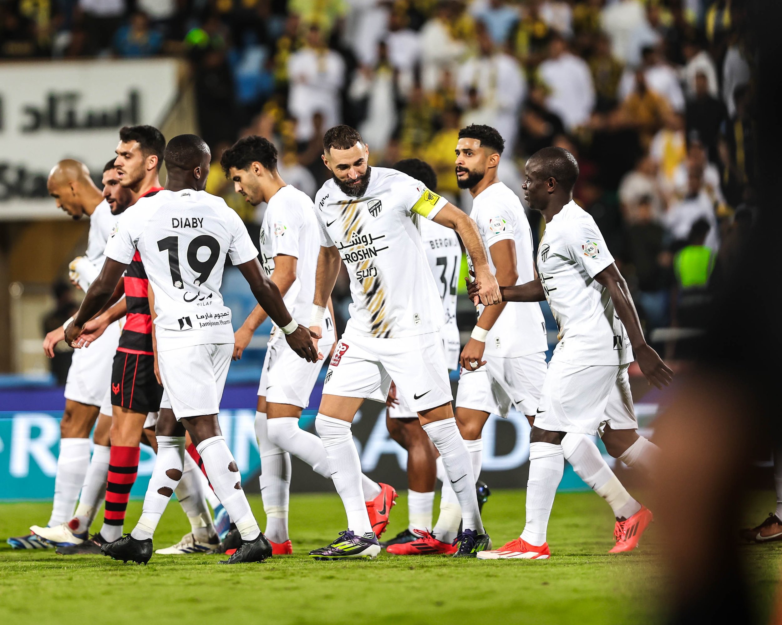
Away Kit Storytelling
The away kit design drew inspiration from the club’s mascot, the tiger, incorporating its distinctive stripes in a fresh and innovative way. As the platform to showcase the club’s embrace of progressive design, this kit looked to push creative boundaries while staying rooted in the club’s identity. To introduce additional colour beyond the traditional yellow, black, and white palette, the design leveraged a colour halftone technique, adding depth and modernity.
This approach utilized CMYK colour separation, where individual halftone dots in cyan, magenta, yellow, and black were printed in a way that allowed viewers to perceive different colours based on their distance from the kit. Up close, the distinct dots were visible, showcasing a full spectrum of colour. From a distance, however, the design seamlessly blended to align with the club’s classic yellow, black, and white identity, creating a visually engaging and multi-dimensional effect that becomes more interesting the longer you look at it.

Production Limitations
The specific kit production model used in this case, post-production customisation, presented certain technical constraints when utilising the sublimation printing process. To ensure efficient production while maintaining design integrity, the kit was designed with a central stripe as the primary graphical element. This placement minimised the need for complex masking, allowing for a clean, uninterrupted sublimation print that extended effortlessly to the bottom of the jersey. This look then matched what would have been done if the sublimation had been done at source.
By balancing an innovative graphic style with manufacturing feasibility, the away kit achieved a visually striking look while remaining true to the club’s heritage whilst meeting the club’s goals.

Action Shots:


